Isteer Blog
Your one-stop for the latest blogs
HOME | INSIGHTS | BLOGS
Data Visualization Tools for Business Decision-Making
June 28, 2024

Would you agree with me if I said that those who read books have a very active imagination and for each book you have read, you have a separate movie in your head? Have you also noticed that many times we retain images better than the text?

What is data visualization?
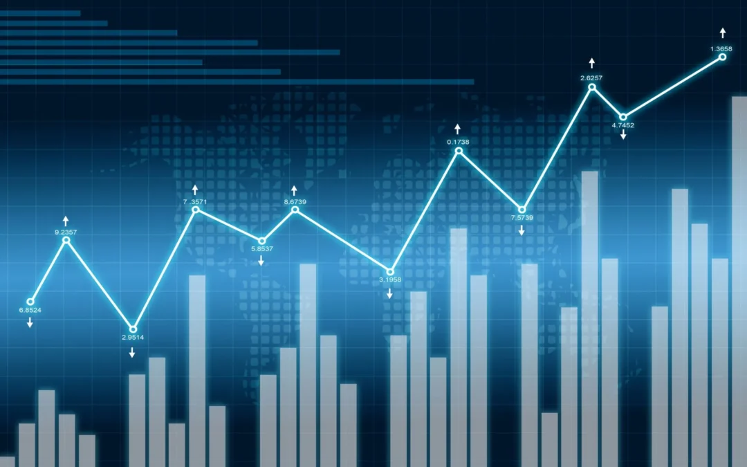
Any form of data can be represented with the help of images, for a better understanding. Data visualization is the process of creating a visual representation of the information within a dataset.
There are many forms of representing your data, some of the most common data visualization techniques include:
- Pie charts
- Bar graphs
- Histograms
- Maps
Why is data visualization important?
Visualizing data simplifies understanding and empowers employees to use concrete information for more data-driven processes. It is crucial for communicating with external parties, and many organizations are hiring individuals skilled in data visualization and other data science abilities.
What are data visualization tools?
A data visualization tool is designed to visualize the data from a dataset and can even design the visualization.
- Microsoft Excel (and Power BI): Microsoft Excel is known for creating spreadsheets, and it also enables you to create charts from the data provided. Microsoft developed PowerBi as a tool specializing in data visualization and it is capable of importing data from various sources to create diverse visualizations.
- Google Charts
Google Charts is a popular free tool for creating interactive data visualizations online. It can pull data from various sources and offers 18 types of charts, including bar and geo charts. The Google community also shares advanced charts in a gallery. - Tableau
Tableau is a business intelligence and data analytics platform that connects to data sources and creates dashboards with visual representations of raw data. However, large datasets can be challenging for those without a background in development or computer science. - Zoho Analytics
Zoho Analytics is a data visualization tool for visualizing business intelligence, commonly used for sales, marketing, and financial data with user-friendly dashboards. The tool aids in data preparation, visualization, and exploration, using AI technology and pre-built templates to track key metrics and discover insights. - Datawrapper
Datawrapper generates charts, maps, and graphics for online use, originally designed for reporters but useful for any web professional. While easy to use, it requires manual data input and doesn’t integrate with data sources. Common outputs include scatterplots, line charts, bar charts, and maps, with both free and paid versions available. - Infogram
Infogram is a popular tool for generating charts, reports, maps, and infographics, favored by creative professionals. It features a drag-and-drop editor for ease of use, especially for beginners. Visualizations can be saved as images, GIFs, or HTML, with pricing options ranging from free to enterprise-level. - ThoughtSpot
ThoughtSpot excels in AI-driven self-service analytics and data visualization, allowing users to discover insights through simple language queries. Its Liveboards offer real-time data comprehension and support seamless sharing of insights for data-driven decision-making. - Qlik Sense
Qlik Sense is an advanced analytics platform for exploring data, deployable on-premise or in the cloud. It aids in finding insights and making faster decisions, emphasizing ease of data source connections and flexible embedding. - Alteryx
Alteryx Designer empowers organizations to optimize business outcomes through data-driven decision-making. It delivers valuable insights, enhances customer experience, drives cost savings, and facilitates digital transformation. By automating manual processes and accelerating insight generation, Alteryx Designer enables quicker decision-making and empowers employees with informed choices. - TrendMiner
TrendMiner provides tools for organizations to optimize processes, offering self-service analytics for quickly visualizing time series-based data. This supports faster production process optimization without requiring a data scientist.
Real-world examples
- Netflix: Uses data visualization to analyze viewer preferences and guide content creation strategies, ensuring popular and profitable original productions.
- Airbnb: Implements dynamic pricing strategies based on visualized market data to optimize host earnings and user satisfaction.
- NASA: Utilizes 3D visualizations for mission planning and spacecraft navigation, enhancing operational efficiency and scientific discovery.
- Johns Hopkins University: Developed a widely-used COVID-19 dashboard to track global virus spread, aiding public health decisions worldwide.
- Uber: Employs real-time visualization for surge pricing and service optimization, enhancing transparency and user decision-making.